E-blasts can be effective ways to engage the interest of your customers or to gain new customers. However, unless they are carefully planned out, they can be a disaster like the one I received today.
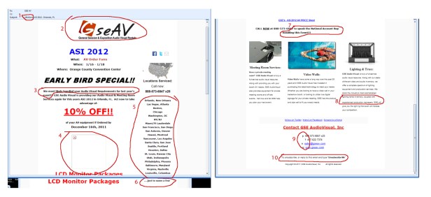
Here’s an image of the e-blast pieced together. It was so long and rambling, I had to cut it into multiple pieces. I circled the 10 offenses outlined below.
Here are 10 things that ruined this e-blast for me:
- There was a misspelling in the subject. That is my number one reason to instantly dismiss the legitimacy of an e-blast.

- The logo is blurry. Hopefully, an advertising piece such as this would be created by the marketing/promotions department and they should have quality versions of your company logo.

- Strange choice of words. “We most likely handled…” This isn’t horrible, but it is awkward and could have been worded differently. It also doesn’t make me feel valued if I was a customer last year—don’t they know who their own customers are?

- Broken image link, the most obnoxious offense in e-blasts. Need I say more?

- Unorganized rambling list of both cities and entire states as serviced locations. A better way to have handled this would be to either omit it completely since there’s already a map illustrating general service locations or to list cleanly in alphabetical order, and choosing either cities or states.

- “Just to name a few…” Last time I checked, 37 was not just a few. I get what they’re trying to say here, but in this case, I’d even accept 10 as a few. But 37 as “just a few” is obnoxious.

- Inconsistent capitalization combined with centering and odd sentence splitting makes it confusing to read this simple sentence. This is a sentence, so don’t write it in heading format.

- Extra spacing between lines. There is a random extra space in this paragraph that is highly distracting and unnecessary.

- Unnecessary abbreviation. With all the space the rest of the email took up, they choose to abbreviate the contact information. It took me a minute to try to figure out what w or e stood for. Either spell out phone, fax, email and website or omit it so I don’t get distracted trying to figure out what they’re saying.

- Incoherent sentence. It looks like maybe the sentence had previously read “Click here to unsubscribe, or reply…” but that’s not what it says now and it doesn’t make much sense. Kudos for offering an unsubscribe option (as required by CAN-SPAM law) but strike for the odd way of wording it.

Here’s how I re-did the e-blast to show an example of a clearer, cleaner message. Click to view the fully functioning html version.
What are things that annoy you about bad e-blasts?


