Even fairly seasoned Photoshop users may not have much or any experience working with Blend Modes, but they can prove to be extremely helpful in getting your image to look as realistic as possible.
Working in the sporting goods manufacturing industry, I am constantly working with images of 3D objects. In preparing these images for web use or showing a customer what their logo will look like on a ball, I am regularly faced with the challenge of putting a flat image on a pebbled surface when creating virtuals. While it could be understood that a virtual is a glorified drawing, it is also very helpful to provide the most realistic view of the finished product.
There are several ways to accomplish this task. One way is by adding a 5-10% opaque layer of the ball over the top of the logo or decreasing the opacity of the logo by 5-10%, however that affects the integrity of the logo by changing the color.
Another way is to create a pattern of the pebble by cropping a sample of the ball, adjusting coloring and/or using a mask and saving the sample as a pattern. Simply apply the pattern over the logo or image, drop the pattern opacity low enough to show, but not high enough to affect the logo and you will see a patterned logo. The problem with this is that the pattern may not match the background quite right so it can be counterproductive, making the logo look more distracting and separate than as actually being on the item.
One of the best ways I have found (so far) is to use a blending mode. You will find this in CS4/CS5 at the top of the Layers panel, next to Opacity. It should default to “Normal.” To gain access to advanced blending options, you can also access it through the FX tab at the bottom of the Layers panel, or by right clicking on the layer and selecting Blending Options.
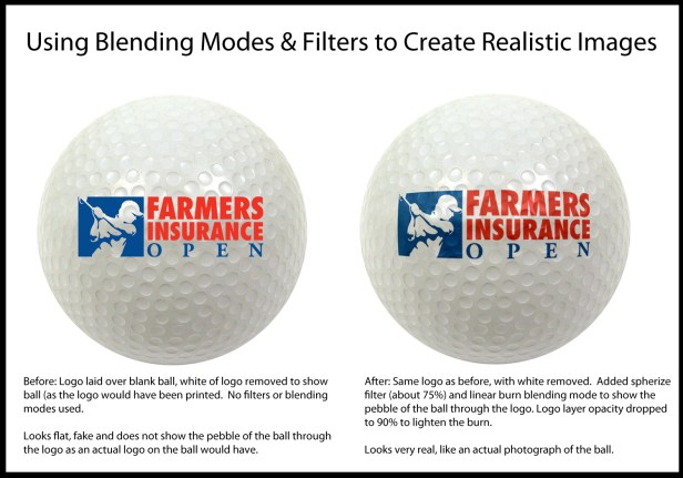
Below is an example of the difference between not using a blending mode and using a blending mode. The image on the left looks really fake, the logo just sitting on top of the ball, no texture showing whatsoever, other than where I cut the white out of the logo to show the ball through.
The image on the right looks like an actual photograph of the ball! I added a spherize filter of about 75% to give the logo the appearance of being wrapped around the ball. I then added a linear burn blending mode to the logo to attach it to the pebbling underneath. Finally, I decreased opacity to correct the logo color.
Experiment with the different blending modes to see what works best for what you are doing and to learn what each setting does. While most of the options won’t work for your current project, it’s good to keep in mind the other possibilities for future projects.
Happy Photoshopping!

